

What if the biggest checkout obstacle isn’t the payment itself, but uncertainty around it? Building customer trust at checkout starts with answering the questions shoppers may be asking: What will I pay? Is this payment flow secure? Can I get help if something goes wrong?
Customers may hesitate when extra costs appear late, payment choices are difficult to compare, or security messages are vague. A checkout should make the next step clear and predictable, not leave people guessing.
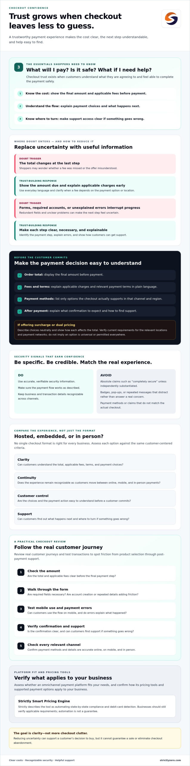
This guide explains how to make payment options and total costs easier to understand, present security and support information customers can recognize, and reduce friction in the payment journey. You’ll also learn how to assess improvements against your current setup, whether customers pay online, in person, or across multiple channels. The goal isn’t to add badges or features for their own sake. It’s to make each choice easier to trust, so customers can complete purchases with confidence.
Key Takeaways
- Building customer trust at checkout means making the transaction understandable, from the order total to what happens after payment.
- Show payment options and any applicable fees accurately, using plain language customers can understand before they commit.
- Compare hosted, embedded, and in-person checkout based on clarity, continuity, customer control, and support, rather than assuming one format suits every business.
- Review real customer journeys and test transactions to spot friction in required fields, mobile use, payment errors, confirmations, and support access.
- Assess whether an omnichannel payment platform fits your needs, and verify how its pricing tools and payment options apply to your business.
Why building customer trust at checkout starts with reducing uncertainty
Checkout trust is a customer’s confidence that they understand what they’re agreeing to and can complete the payment safely. Put simply: Checkout trust exists when customers know what they’ll pay, what happens next, and where to turn for help. This idea connects to the broader concept of customer trust, which helps people feel more comfortable taking action when they rely on another party.
Confidence can be shaken by a total that changes at the last step, unclear payment terms, an unfamiliar payment option, or no visible way to get support. Required account creation, confusing forms, and unexplained errors add friction. Reducing these uncertainties can support a customer’s decision to buy, but it can’t guarantee a sale or eliminate checkout abandonment.
For a broader look at building customer confidence, watch this video:
Which checkout moments create the most doubt?
Unexpected totals can make shoppers wonder whether they missed a fee or misunderstood the offer. Show applicable charges before the final payment step and explain them in plain language. For example, if delivery charges or payment terms affect the total, make that clear before the customer commits.
Next, review the steps between choosing a product and paying. Required account creation, redundant form fields, and errors without a clear explanation can interrupt progress. Reassurance is useful when it addresses a real concern, such as identifying the payment step or explaining how to contact support. Too many badges, pop-ups, or repeated messages can distract customers instead.
What does a trustworthy checkout communicate?
A clear checkout brings essential information together before payment: the final amount, relevant fees, payment terms, and policies that may affect the purchase. Display only payment methods your checkout actually supports. Make the payment action easy to understand, then tell customers what confirmation to expect and how to find support if something goes wrong.
Keep security messaging specific and credible. Avoid absolute statements such as “completely secure” unless they’re independently substantiated. Use accurate, verifiable information, and ensure the payment flow works as described. Consistency matters: whether a customer pays online, on mobile, or in person, they should recognize the business, understand the transaction, and know what to do next.
How clear pricing, payment choices, and security signals build checkout confidence
Clear checkout details let customers assess a purchase before committing. Show the order total, explain applicable fees in everyday language, and make payment choices easy to understand. If a charge depends on the payment option or location, explain when it applies instead of expecting customers to infer the reason from a changed total.
Payment options should match what your processor and checkout actually support. Before listing a card brand, wallet, or other method, verify that it works in the relevant channel and region. Consistency matters, too: customers moving between online, mobile, and in-person payments should encounter familiar, accurate information. For more on payment experiences across channels, see this ecommerce payment processing guide.
How should businesses explain fees and payment options?
Display the amount due and any applicable fee before the customer submits payment. If you offer surcharge or dual-pricing options, describe the choices neutrally and show how each affects the total. Don’t suggest a fee is universal, mandatory, or permitted in every situation. Requirements can vary, so verify current rules for the relevant locations and payment networks before presenting the option.
Payment tools can help present pricing more clearly, but they don’t remove the need to check how the setup applies to your business. Strictly describes its Smart Pricing Engine as automating state-by-state compliance and debit-card detection. Businesses should still verify applicable requirements rather than treating automation as a guarantee.
Which security and policy details reassure without overpromising?
Use security messages that explain something specific and verifiable, such as the payment steps customers can expect or how to reach support. Avoid vague badges and absolute claims like “completely secure.” Describe only security controls your business or processor can substantiate, and make refund, privacy, and support information easy to find before payment.
PCI DSS is a payment card security standard, not a badge to claim without evidence. The current standard is PCI DSS v4.0, with its new requirements mandatory for validation as of March 31, 2025. Describe your organization’s status only if it’s been confirmed through the appropriate validation process. Don’t imply certification simply because a payment provider is involved.
As you review your checkout, prioritize accurate totals, supported payment choices, and security details that stand up to scrutiny. Businesses comparing ways to handle online, in-person, and mobile payments can also assess Strictly’s omnichannel payment processing platform against their requirements.
How to compare checkout experiences without sacrificing customer trust
A checkout format should suit how customers pay while keeping the transaction understandable from start to finish. Compare options by how clearly they show payment details, whether the experience feels continuous, what customers can control, and how they can get help. No single format is best for every business, and a redirect or embedded form isn’t inherently more secure without evidence about how it’s designed and managed.
Hosted versus embedded online checkout
A hosted checkout sends customers to a payment page, while an embedded flow keeps payment on the business’s site or app. A redirect can make the payment step distinct, but an unfamiliar page may interrupt the sense of continuity. An embedded flow may feel more integrated, though it still needs to work clearly on mobile. Test both options on real devices. Check branding, error messages, payment confirmation, and how customers return to the order if something goes wrong.
| Experience | What to assess | Possible trade-off |
|---|---|---|
| Hosted online | Clear handoff, recognizable payment page, return path | A redirect can feel like a break in the journey |
| Embedded online | Mobile layout, visible payment steps, useful error guidance | An integrated look still needs clear feedback and support |
| In person | Visible total, clear payment choices, accessible assistance | Staff may need to explain steps or resolve confusion |
Online versus in-person payment experiences
Customers should understand the amount due, available payment choices, and confirmation process whether they pay online, on a mobile device, or in person. Compare the actual journey across channels: do totals and fee explanations match, are payment methods described accurately, and does the customer know when the transaction is complete? Staff can provide assistance in person, while online flows need instructions and support routes customers can find without asking someone nearby.
Include accessibility in the comparison. Check that text is readable, controls are easy to use, and key steps don’t rely on color alone. If customers move from browsing on mobile to paying in person, consistent language and pricing can make the handoff more coherent. The credit card processing services guide offers broader context for evaluating processor considerations alongside the customer experience.
Use these criteria to identify where your current setup creates unnecessary friction, then compare payment solutions with the needs you’ve confirmed. Businesses assessing payments across online, in-person, and mobile channels can also consider omnichannel payment processing as a potential fit.
How to improve checkout trust: a practical review checklist
A useful checkout review starts with the experience customers actually encounter, not assumptions about what should work. Complete a test purchase from product selection through confirmation, and note each point where the next step, total, or payment outcome feels unclear. This audit can turn building customer trust at checkout into specific improvements rather than a vague design goal.
Run a checkout walkthrough before changing the design
Test the flow on devices and screen sizes your customers commonly use. If possible, ask a small group of representative users to complete a purchase and explain what they expect at each step. Watch where they pause, ask questions, or interpret a label differently than intended. Record what you observe before proposing fixes.
- Check the price path. Follow the order from selection to payment. Confirm that the amount due and any applicable fees are visible before the customer commits, and that the figures remain consistent through confirmation.
- Review every field and instruction. Identify required information, remove fields that aren’t necessary for the transaction, and make formatting or validation guidance clear. Check whether account creation is required and whether customers understand why.
- Test mobile usability and accessibility. Complete the flow on a phone as well as a desktop. Check that text is readable, controls are easy to select, and customers can move through forms without losing entered information.
- Trigger and inspect payment errors. Use test transactions or approved test tools to review how checkout handles an unsuccessful payment. The message should explain what happened and what the customer can try next without exposing sensitive information.
- Confirm the ending and support route. Check that a successful payment produces an understandable confirmation and that customers can find relevant order details and a support contact afterward.
Measure whether changes improve clarity
Use evidence to decide what to fix first. Review checkout completion alongside payment failures, form errors, and customer support questions. Prioritize issues that repeatedly confuse customers or interrupt payment, weighing their likely impact against the effort required to address them.
After making a change, compare results over a defined period and account for shifts in traffic, promotions, or other factors that could affect the numbers. Don’t credit a design update for every change in performance. If reviewing a platform is part of the work, use this guide to payment processing considerations to structure your questions.
Once your audit identifies what the checkout needs, review Strictly’s omnichannel payment processing as an option for online, in-person, and mobile payments.
How Strictly’s payment platform can support a clearer checkout experience
Once you’ve identified where customers encounter friction, compare payment platforms against those specific needs. Strictly provides payment processing for online, in-person, and mobile transactions through one platform. This can help businesses assess cross-channel consistency in one place, but a unified platform doesn’t guarantee that every channel will look or feel identical. Review the actual customer journey in each setting.
Match platform capabilities to the checkout problems identified
Choose tools based on how customers pay and what your workflow requires. For example, a virtual terminal may be relevant for taking payments through a web-based interface, while payment links can suit situations where customers need a way to pay outside a standard online checkout. Recurring billing may be worth evaluating for repeat-payment workflows. Confirm how each capability works for your use case before relying on it.
Before selecting a platform, ask which integrations and payment methods it supports, how payment errors and confirmations appear to customers, and what onboarding involves. Test the relevant online, mobile, and in-person journeys if possible. Check that pricing information and payment instructions are understandable at every touchpoint. Don’t assume that using one provider automatically creates a consistent experience.
Evaluate surcharge and dual-pricing options responsibly
Clear fee presentation is central to building customer trust at checkout. If you’re considering surcharge or dual-pricing options, check how the choices are shown and whether customers can understand the amount due before they pay. Requirements may depend on location, card network, and other circumstances, so verify current requirements for your business rather than treating any approach as universal.
Strictly offers surcharge and dual-pricing tools, including a Smart Pricing Engine described as automating state-by-state compliance and debit-card detection. Those capabilities don’t remove the need to confirm the setup, supported payment methods, and applicable requirements for your circumstances. Ask how the tools work in your specific configuration, and review customer-facing fee disclosures before launch.
A platform is a good fit only if its capabilities match the checkout issues you’ve identified and hold up in testing. Consider the required channels, workflows, integrations, payment methods, and fee presentation. Confirm any unanswered questions directly before making a decision.
To review the platform against your requirements, explore Strictly’s payment processing platform.
Make your next checkout improvement count
Building customer trust at checkout comes down to reducing doubt at the moments customers make decisions. Make the total and payment terms easy to understand, ensure each step works smoothly across the channels you use, and give customers clear confirmation and a way to find support. Then test the full journey and prioritize changes based on what customers experience and what your data reveals.
If you’re assessing payment options, compare platform capabilities with your actual checkout needs. Strictly offers payment processing for online, in-person, and mobile transactions, along with a virtual terminal, payment links, and recurring billing. Its surcharge and dual-pricing program includes a Smart Pricing Engine. Confirm how its capabilities and applicable requirements fit your business before changing fee presentation.
Explore Strictly’s payment processing platform to see whether it aligns with your payment workflows. A clearer checkout is built one considered improvement at a time. Start with the step creating the most uncertainty for your customers.
Frequently Asked Questions
What does building customer trust at checkout mean?
Building customer trust at checkout means making it clear what customers are buying, what they’ll pay, how payment works, and where they can get help. The process should behave predictably, with understandable next steps if a payment succeeds or an error occurs. No badge or design element creates trust by itself. Clear, consistent information throughout the transaction gives customers a better basis for deciding whether to proceed.
How can I make my checkout feel more trustworthy?
Show the full amount and relevant terms before payment, use clear labels, and remove form fields that aren’t needed to complete the purchase. Explain payment and security details accurately, and make refund, privacy, and support information easy to find. Test the flow on mobile as well as desktop. Then review customer questions and checkout errors to identify unclear instructions or steps that may be creating hesitation.
Can adding more payment options increase customer trust?
Additional payment options can support trust when they’re relevant to customers and clearly explained, but more choices aren’t automatically better. Confirm which methods your payment processor supports and consider which ones your customers use before adding them. Label available options accurately, explain any relevant terms, and test the complete payment journey. Customers should understand their choice and see clear confirmation after paying.
Does displaying a security badge guarantee customers will trust checkout?
No. A badge alone doesn’t prove that a checkout is safe, and an unclear or unsupported claim may undermine confidence. Use security statements only when they accurately describe practices you can verify. Make privacy information, contact details, and payment terms accessible before customers pay. If you display a third-party mark, confirm that you’re authorized to use it and follow the provider’s requirements for how it appears.
How should a business explain a checkout surcharge to customers?
Show applicable pricing and fee information before customers commit to payment, using plain language and a neutral explanation. Make clear how the fee affects the amount due and which payment choice it applies to. Requirements can vary by location, payment network, and transaction circumstances, so verify the current rules that apply to your business before publishing disclosures. Don’t assume a surcharge is permitted or handled identically in every situation.
What happens if customers abandon checkout after seeing the total?
Treat checkout abandonment after a total appears as a reason to investigate, not proof of one specific problem. Check whether fees, taxes, shipping, or other terms appeared later than customers expected. Review checkout analytics, support questions, and customer feedback for patterns. Then make the total easier to understand earlier in the journey and test the change. Compare results carefully, since other factors may also affect customer behavior.
How can I measure whether checkout changes build customer trust?
Use several indicators rather than relying only on completed purchases. Compare checkout completion with errors, payment failures, and customer questions before and after a change. Set a clear measurement period and note other influences, such as promotions, traffic sources, or seasonal shifts, that could affect results. Customer feedback can also reveal confusion that analytics don’t explain, helping you decide whether the checkout has become clearer.